
 Words and Phrases


Selecting values from options on a form
Forms Designer offers two controls that allow users to select a value from a list of options on the form.
- Radio Button
- Checkbox
You can determine which of these two controls to use by determining if the options on the form are mutually exclusive.
If you want users to select one value from a list of mutually exclusive values, then list each option as a Radio Button control.
If you want users to select a true or false value for one particular option, then use a Checkbox control for the option.
Radio Button
The Radio Button control lists one possible value for a set of mutually exclusive values that a user can choose from. You determine the list of possible values by creating multiple Radio button controls and giving them all the same Input attribute.
Example Radio Button control

The benefits of a Radio Button control are listed below.
- The user sees a complete list of values to choose from on the same form as the control.
- The user has a visual indicator for the currently selected value.
- You can control both the label users see for the option (the Caption attribute) and the actual value the option has when stored in the database (the Value attribute).
The costs of a Radio Button control are listed below.
- The more options there are to display, the more of the form's screen space is required to display them.
- You have to use a Frame or Group control to indicate that a list of Radio Button options are related.
- The list of values is only stored on the form and not in a global list or related record. This means you have to keep track of which forms use a particular list if you want to re-use the list in another form.
- The only way to change the list of values is to change the value of each individual Radio Button control.
- Each Radio Button option increases the size of the form. The larger a form is, the longer it takes for the client to initially display it.
A list of Radio Button options is very easy for your system to display since there are no link queries run or global lists to update at start-up. However, a list of Radio Button options requires more form space than using a single Combo box or Comfill control.
In general, a Radio Button control is best used in the following circumstances.
- There are few enough options to display that the user can see them all without needing to scroll to see more options.
- The list of options either does not change at all or changes infrequently.
- You want a visual indicator to highlight the currently selected value.
- You cannot select more than one value at a time with this control.
If you have more than a few options to display, consider using a Combo Box control instead to reduce the amount of screen space required to display the options. Also, if you expect to re-use the list of options in another form or in other circumstances, consider creating a global list so the options will be available for multiple forms. If you want users to be able to select more than one value from a list of values, consider creating a list of checkboxes.
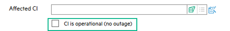
Check Box
The Check Box control lists a true or false value for a single option. The list of possible values is always true or false for a Check Box control.
Example Check Box control
The benefits of a Check Box control are listed below.
- The value of each Check Box control is independent of other Check Box controls.
- The user has a visual indicator for the currently selected value.
- The actual value of the control is always either true or false.
- You can control the label users see for the control (the Caption attribute)
The costs of a Check Box control are listed below.
- You cannot use this control to provide a list of mutually exclusive options.
- You may have to use a Frame or Group control to indicate that a list of Check Box options are related.
A Check Box control is very easy for your system to display since there are no link queries run or global lists to update at start-up. The longer the Check Box label is the more form space the control requires.
In general, a Check Box control is best used in the following circumstances.
- The only options the user needs to choose between are true and false values.
- The values of one control are independent of the values in other controls.
- You want a visual indicator to highlight the currently selected value.
If you want users to select one value from a list of mutually exclusive values, use a set of Radio Button controls instead to ensure that only one value can be selected at a time.


