Searching the Help
To search for information in the Help, type a word or phrase in the Search box. When you enter a group of words, OR is inferred. You can use Boolean operators to refine your search.
Results returned are case insensitive. However, results ranking takes case into account and assigns higher scores to case matches. Therefore, a search for "cats" followed by a search for "Cats" would return the same number of Help topics, but the order in which the topics are listed would be different.
| Search for | Example | Results |
|---|---|---|
| A single word | cat
|
Topics that contain the word "cat". You will also find its grammatical variations, such as "cats". |
|
A phrase. You can specify that the search results contain a specific phrase. |
"cat food" (quotation marks) |
Topics that contain the literal phrase "cat food" and all its grammatical variations. Without the quotation marks, the query is equivalent to specifying an OR operator, which finds topics with one of the individual words instead of the phrase. |
| Search for | Operator | Example |
|---|---|---|
|
Two or more words in the same topic |
|
|
| Either word in a topic |
|
|
| Topics that do not contain a specific word or phrase |
|
|
| Topics that contain one string and do not contain another | ^ (caret) |
cat ^ mouse
|
| A combination of search types | ( ) parentheses |
|
Proposal Analytics
The Proposal Analytics feature enables you, the portfolio managers, to analyze proposals and evaluate their business values when you select the candidate projects.
To access Proposal Analytics
From the main menu, select Plan > Idea & Proposal > Proposal Analytics.
User interface elements
The Proposal Analytics user interface (UI) includes the following:
Filter panel 

You can find the Filter panel on the upper-left side of the UI. By default, the following filter options are selected:
| Filter option | Value |
|---|---|
| Phase Id | Review |
| Business value |
>0 |
| Cost | >0 |
| Risk rating | >0 |
You can click the Clear all button to clear the default filter options and customize the filter options by clicking the Filter ![]() button. A list of fields in the proposal record is displayed.
button. A list of fields in the proposal record is displayed.
For detailed explanation of these fields, see How to edit a proposal.
Proposal list panel

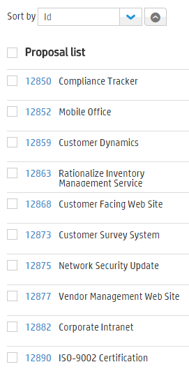
The Proposal list panel is on the left-hand side. The following elements are included:
| UI element | Description |
|---|---|
| Sort by |
To change the sorting option, select a field from the Sort by drop-down list. For detailed explanation of these fields, see How to edit a proposal. By default, proposals are displayed in ascending order. To reverse the sorting order, click the Descending |
| Proposal list title |
To select all proposals in the list, select the check box before the proposal list title. |
| Proposals |
All proposals that meet the filter criteria are displayed:
The proposal list can display 100 proposals at maximum. Exceeded proposals are not displayed. |
Bubble chart
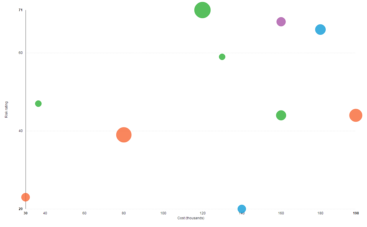
Each proposal in the Proposal list panel is displayed as a bubble in the bubble chart. Selected proposals are highlighted in the bubble chart. You can also select bubbles from the chart directly. By doing so, corresponding proposals are selected from the proposal list.

When you hover over the bubble, the following information about the proposal is displayed:
- ID
- Title
- Business value
- Owner
The bubble chart includes the following elements:
| UI element | Description |
|---|---|
| Bubble size | Indicates the business value of the proposal — the larger in size, the higher in business value. |
| Bubble color |
Indicates different business units. The legend in the chart provides more information. |
| X axis of the chart | Indicates the cost of the proposal. |
| Y axis of the chart | Indicates the risk rating of the proposal. |
Summary panel

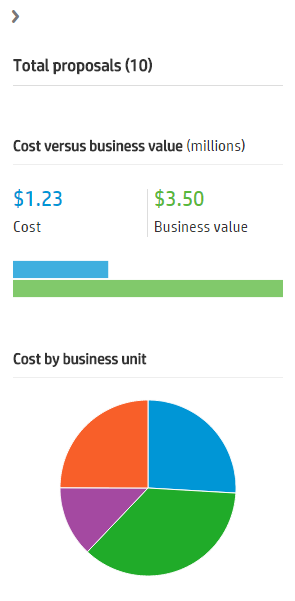
Click ![]() to expand the Summary panel on the right-hand side. The following elements are included in this panel:
to expand the Summary panel on the right-hand side. The following elements are included in this panel:
| UI element | Description |
|---|---|
| Total proposals | The number of proposals in the proposal list, enclosed by parentheses. |
| Cost versus business value |
The total cost and business value of the selected proposals. The bar chart shows a comparison between the cost and the business value of the selected proposals. The blue bar indicates the cost; the green bar indicates the business value. |
| Cost by business unit | A comparison of the business unit costs is shown in the pie chart. Different colors indicate different business units. |
Related topics


