Searching the Help
To search for information in the Help, type a word or phrase in the Search box. When you enter a group of words, OR is inferred. You can use Boolean operators to refine your search.
Results returned are case insensitive. However, results ranking takes case into account and assigns higher scores to case matches. Therefore, a search for "cats" followed by a search for "Cats" would return the same number of Help topics, but the order in which the topics are listed would be different.
| Search for | Example | Results |
|---|---|---|
| A single word | cat
|
Topics that contain the word "cat". You will also find its grammatical variations, such as "cats". |
|
A phrase. You can specify that the search results contain a specific phrase. |
"cat food" (quotation marks) |
Topics that contain the literal phrase "cat food" and all its grammatical variations. Without the quotation marks, the query is equivalent to specifying an OR operator, which finds topics with one of the individual words instead of the phrase. |
| Search for | Operator | Example |
|---|---|---|
|
Two or more words in the same topic |
|
|
| Either word in a topic |
|
|
| Topics that do not contain a specific word or phrase |
|
|
| Topics that contain one string and do not contain another | ^ (caret) |
cat ^ mouse
|
| A combination of search types | ( ) parentheses |
|
Layout Properties Dialog Box
This dialog box enables you to customize the layout of a specific layer in a view, to achieve the clearest presentation possible and to better understand and monitor the managed data.
| To access | Select Layout > Layout Properties. |
| Important information |
You define the layout of a view's layers by assigning logical positions for the graph's nodes and relationships that appear in a layer. You customize the layer layouts by modifying the default values. You set layout definitions for a specific layer only. The definitions cannot be saved for a different layer or a different view. Parameter values are in pixels. |
| See also |
Global Tab
This area enables you to define global layout parameters.
| To access | Click the Global tab in the Layout Properties dialog box. |
| Important information | The Global tab enables you to define global settings for the layout. |
User interface elements are described below:
| UI Element (A-Z) | Description |
|---|---|
| Drawing Fitting |
Select one of the following options for fitting the layout:
|
| Labeling | Select Perform Labeling to ensure that the labels appear when the layout is redrawn. If this field is not selected, labels do not appear in the redrawn layout. |
| Style | Select Apply Style Deeply to apply the layout selected to all nested layers of the topology map. |
All Styles Tab
| To access | Click the All Styles tab in the Layout Properties dialog box. |
| Important information |
The All Styles tab enables you to define general layout parameters for disconnected graph nodes and connected components.
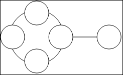
This illustrates a connected component with five graph nodes:
This illustrates a connected component with two graph nodes:
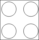
This illustrates four disconnected components, each made up of a single, disconnected graph node:
|
User interface elements are described below:
| UI Element (A-Z) | Description |
|---|---|
| Components |
The spacing between the components in a disconnected graph consists of both a constant value and a proportional value based on the sizes of the components. Select Detect Components to view the disconnected components. You can specify that all components be laid out together or individually, regardless of the other components. If the grouping for components is selected, each component is laid out, and the resulting components are packed together. When Detect Components is selected, enter values for the following settings:
|
| Disconnected Graph Nodes |
The spacing between the graph nodes in a disconnected graph consists of both a constant value and a proportional value based on the sizes of the graph nodes. Select Detect Disconnected Graph Nodes to view the disconnected graph nodes. You can specify that disconnected graph nodes be grouped into one component or laid out individually. When Detect Disconnected Graph Nodes is selected, enter values for the following settings:
|
| Margin Spacing | Enter values for the right, left, top, and bottom margin spacing for the layout. |
Circular Tab
| To access | Click the Circular tab in the Layout Properties dialog box. |
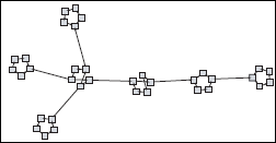
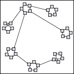
| Important information | The Circular tab enables you to group a graph's nodes into groups or clusters based on the grouping options you select. It is particularly suited for visualizing ring and star network topologies, and for link analysis. |
User interface elements are described below:
| UI Element (A-Z) | Description |
|---|---|
| Clustering |
Set the values for the following settings:
|
| Cluster Layout Style |
Displays clusters either in a symmetric or circular layout style. Select one of the following options:
|
| Layout Quality |
Adjusts the quality of the layout produced to fit your application's needs. The quality reflects the number of steps or the method used to produce the layout. For example, high quality is sharper but takes more time to set the layout. Select one of the following options:
Note The differences between the speed and resulting layout of each quality setting varies depending on the nature of the graph being laid out. You can try each option to determine which works best for you. |
| Spacing |
Sets the spacing around each graph node within the same cluster and between clusters. Enter values for the following settings:
This illustration shows smaller graph node spacing:
This illustration shows larger graph node spacing:
This illustration shows smaller cluster spacing:
This illustration shows larger cluster spacing:
|
Hierarchical Tab
| To access | Click the Hierarchical tab in the Layout Properties dialog box. |
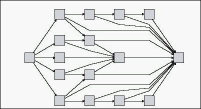
| Important information | The Hierarchical tab shows the precedence relationships that can represent organizational or information management system dependencies, as well as process models, software call graphs, and work flows. The hierarchical layout emphasizes dependencies by placing the graph nodes at different levels. |
User interface elements are described below:
| UI Element (A-Z) | Description |
|---|---|
| Backward Edges |
Specifies how backward relationships are displayed in the hierarchical layout. Select one of the following options:
|
| Horizontal Spacing |
Enables you to set the minimum horizontal distance between two neighboring graph nodes at each level. Enter values for the following settings:
|
| Layout Quality |
Adjusts the quality of the layout produced to fit your application's needs. The quality reflects the number of steps or the method used to produce the layout. For example, high quality is sharper but takes more time to set the layout. Select one of the following options:
Note The differences between the speed and resulting layout of each quality setting varies depending on the nature of the graph being laid out. You can try each option to determine which works best for you. |
| Level Alignment |
Enables you to set the way graph nodes are vertically aligned. Select one of the following options:
|
| Orientation |
Enables you to set the orientation of the hierarchy. Select one of the following options:
|
| Orthogonal Routing - Fix Node Sizes | This setting is available only when you select Routing > Orthogonal. Maintain the size of a graph node. Clear this option if you want the layout to increase the size of a graph node, if it is necessary to maintain the specified relationship spacing, when more than one relationship is attached to the same side of the graph node. |
| Polyline Routing - Spacing Between Bends |
This setting is available only when you select Routing > Polyline. Polyline routing routes edges (connecting lines) as one or more straight line segments with arbitrary angles. Path nodes are added automatically to prevent the edges (connecting lines) from overlapping. Default Value: 12
|
| Routing |
Select the type of routing for the layout. The available options are:
|
| Undirected Layout | Edge direction is not used to build the levels of the hierarchical drawing. |
| Variable Level Spacing |
Variable level spacing adjusts the spacing between pairs of neighboring levels according to the density of edges between the levels. If the drawing's edges are orthogonally routed, this ensures the desired vertical spacing between horizontal edges (in a top-to-bottom or bottom-to-top layout) routed between levels. If the routing is polyline, variable level spacing makes it easier to distinguish among edges in very dense drawings. |
| Vertical Spacing |
Enables you to set the minimum vertical distance between two neighboring graph nodes on different levels. Enter values for the following settings:
|
Orthogonal Tab
| To access | Click the Orthogonal tab in the Layout Properties dialog box. |
| Important information | The Orthogonal tab enables you to set orthogonal layout route relationships horizontally and vertically. This results in relationships bending at 90-degree angles only. |
User interface elements are described below:
| UI Element (A-Z) | Description |
|---|---|
| Fix Node Sizes | Maintain the size of a graph node. Clear this option if you want the layout to increase the size of a graph node if it is necessary to maintain the specified relationship spacing when more than one relationship is attached to the same side of the graph node. |
| Horizontal Spacing |
Enables you to set the minimum horizontal distance between graph nodes. Select one of the following options:
|
| Layout Quality |
Adjusts the quality of the layout produced to fit your application's needs. The quality reflects the number of steps or the method used to produce the layout. For example, high quality is sharper but takes more time to set the layout. Select one of the following options:
|
| Vertical Spacing |
Enables you to set the minimum vertical distance between graph nodes. Select one of the following options:
|
Symmetric Tab
| To access | Click the Symmetric tab in the Layout Properties dialog box. |
| Important information | The Symmetric tab displays a clear representation of complex networks. The symmetric layout emphasizes the symmetries that may occur in a graph. |
User interface elements are described below:
| UI Element (A-Z) | Description |
|---|---|
| Layout Quality |
Adjusts the quality of the layout produced to fit your application's needs. The quality reflects the number of steps or the method used to produce the layout. For example, high quality is sharper but takes more time to set the layout. Select one of the following options:
Note The differences between the speed and resulting layout of each quality setting varies depending on the nature of the graph being laid out. You can try each option to determine which works best for you. |
| Spacing |
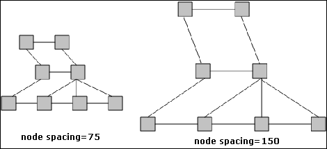
Allows you to set constant horizontal and vertical spacing around each graph node in the layer. The value you specify is a guideline for the layout, so that it is possible that the spacing for a particular pair of graph nodes might be different from the one you specified. The larger the graph node spacing, the farther apart the graph nodes are spaced in the final layout. Default value: 50 The following figure illustrates smaller and larger spacing:
|
Routing Tab
| To access | Click the Routing tab in the Layout Properties dialog box. |
| Important information | The Routing tab enables you to produce drawings that leave graph nodes essentially where they are, and reroute the lines orthogonally. |
User interface elements are described below:
| UI Element (A-Z) | Description |
|---|---|
| Fix Node Positions | Maintain the position of all the graph nodes in the display. Clear this option for the layout to move the graph nodes if it is necessary to improve the layout. The movement is minimal, avoids overlaps, and minimizes bend points. |
| Fix Node Sizes | Maintain the size of a graph node. Clear this option if you want the layout to increase the size of a graph node if it is necessary to maintain the specified relationship spacing when more than one relationship is attached to the same side of the graph node. |
| Horizontal Spacing |
Enables you to set the minimum horizontal distance between graph nodes. Select one of the following options:
|
| Vertical Spacing |
Enables you to set the minimum vertical distance between graph nodes. Select one of the following options:
|
We welcome your comments!
To open the configured email client on this computer, open an email window.
Otherwise, copy the information below to a web mail client, and send this email to cms-doc@microfocus.com.
Help Topic ID:
Product:
Topic Title:
Feedback:


