Searching the Help
To search for information in the Help, type a word or phrase in the Search box. When you enter a group of words, OR is inferred. You can use Boolean operators to refine your search.
Results returned are case insensitive. However, results ranking takes case into account and assigns higher scores to case matches. Therefore, a search for "cats" followed by a search for "Cats" would return the same number of Help topics, but the order in which the topics are listed would be different.
| Search for | Example | Results |
|---|---|---|
| A single word | cat
|
Topics that contain the word "cat". You will also find its grammatical variations, such as "cats". |
|
A phrase. You can specify that the search results contain a specific phrase. |
"cat food" (quotation marks) |
Topics that contain the literal phrase "cat food" and all its grammatical variations. Without the quotation marks, the query is equivalent to specifying an OR operator, which finds topics with one of the individual words instead of the phrase. |
| Search for | Operator | Example |
|---|---|---|
|
Two or more words in the same topic |
|
|
| Either word in a topic |
|
|
| Topics that do not contain a specific word or phrase |
|
|
| Topics that contain one string and do not contain another | ^ (caret) |
cat ^ mouse
|
| A combination of search types | ( ) parentheses |
|
Combo Box control
Use this control to add a Combo Box that enables users to click a button and select from a drop-down list. The items in the list are associated with a database field or variable. Users can also type in a value if the check box in the Select Only property is cleared (set to false).
Refer to the following screenshot as an example of the Combo Box control widget on a Mobile Applications form:

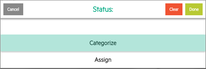
Refer to the following screenshot as an example of the Combo Box selector on a Mobile Applications form:

| Property | Usage |
|---|---|
| Name |
(Optional) Specify a unique identifier for the object on the screen. This name is used by external applications, such as RAD, to dynamically change the properties of the object. This name is also used by the Label For property to specify the label of this widget. |
| Input | Specify the database field or variable to associate with this control. |
| Read-Only | Select this option to disable editing capabilities and provide only viewing access to the field. Give read–only fields a tab–stop value of –1 to prevent users from tabbing into them. |
| Mandatory |
Select this option so that a red asterisk indicating a required field is displayed. This is a visible change only.
|
| Value List |
In conjunction with the Input property, defines how the Display List values are identified in the database. Value and Display Lists are entered using the Edit List dialog box. You can enter hard coded entries for each list, or you can supply a variable as the first and only entry. The run time values of the variable are used to populate these lists. Note When defining Value List and Display List properties, you should avoid using the following reserved characters:
Caution Do not use keys (such as backspace). The system cannot process their ASCII representation entries correctly, which may lead to unpredictable results. |
| Display List |
Specify the values that appear in the drop-down list at run time. There must be a one–to–one correspondence between the values for Value List and for Display List. If the Display List is the only populated property, the display values are written to the database. Note When defining Value List and Display List properties, you should avoid using the following reserved characters:
Caution Do not use keys (such as backspace). The system cannot process their ASCII representation entries correctly, which may lead to unpredictable results. |
Note Combo box is always select-only on Service Manager Mobile Applications.


