
Searching the Help
To search for information in the Help, type a word or phrase in the Search box. When you enter a group of words, OR is inferred. You can use Boolean operators to refine your search.
Results returned are case insensitive. However, results ranking takes case into account and assigns higher scores to case matches. Therefore, a search for "cats" followed by a search for "Cats" would return the same number of Help topics, but the order in which the topics are listed would be different.
 Words and Phrases
| Search for | Example | Results |
|---|---|---|
| A single word | cat
|
Topics that contain the word "cat". You will also find its grammatical variations, such as "cats". |
|
A phrase. You can specify that the search results contain a specific phrase. |
"cat food" (quotation marks) |
Topics that contain the literal phrase "cat food" and all its grammatical variations. Without the quotation marks, the query is equivalent to specifying an OR operator, which finds topics with one of the individual words instead of the phrase. |
Using Boolean Operators
| Search for | Operator | Example |
|---|---|---|
|
Two or more words in the same topic |
|
|
| Either word in a topic |
|
|
| Topics that do not contain a specific word or phrase |
|
|
| Topics that contain one string and do not contain another | ^ (caret) |
cat ^ mouse
|
| A combination of search types | ( ) parentheses |
|


- End User - View and Analyze the Business Objectives
- Dashboard
- Change, On-the-fly, the Component Display Format
- Change, On-demand, the Periodicity Used in a Component Display
- Change, On-Demand, the Breakdown Display
- First Level Navigation (FLN) for an Objective, a KPI, or a Metric
- Explorer
- Explorer - Overview
- Explorer - Data Set
- Explorer - Goal Map
- Explorer - Forecast
- Explorer - What If
- Explorer - Annotations
In some Dashboard page components, you can select to change on-the-fly the format of the display.
In the relevant component, click  and select the relevant format to modify the display on-the-fly.

Components where you can modify the display format, on-the-fly
In the following components, the icon indicates that you can modify the display format, on-the-fly. The components are:
- KPI Rolodex Component
- The Breakdown View Component
- The Bubble Chart View Component
- The Cluster Bar Chart View Component
- The Line and Bar Chart View Component
- The Historical Metric View Component
- The Historical View Component
- The KPI List Component
- The KPI View Component
- The Pie Chart Component
- The Stacked Bar Chart View Component
Available display formats
Some of the formats are not available for some of the components.
-
 - To display the contents of the component using the enriched vertical column format. For details, see Column Format.
 -
 - To display the contents of the component using the horizontal Rolodex or gauge format. For details, see Rolodex - Gauge format.
 -
 - To display the content using the multiple line format. For details, see Multiple or single line format.
 -
 - To display the content using the pie format. For details, see Pie format.
 -
 - To display the content using the bar format. For details, see Bar format
 -
 - To display the content using the horizontal enriched column format. For details, see Column format.
 -
 - To display the content using the vertical Rolodex or gauge format. For details, see Rolodex - Gauge format.
 -
 - To display the content using the single line graph format. For details, see Multiple or single line format.
 -
 - To display the content using the cluster bar format. For details, see Cluster Bar format.
 -
 - To display the content using the stacked bar format. For details, see Stacked Bar format.
 -
 - To display the content using the bar and line format. For details, see Bar and Line format.
 -
 - To display the content using the bubble chart format. For details, see Bubble Chart format.
 -
 - To display the content using the list format. For details, see List format.
Note
| Selected KPIs and Metrics have: | Selected Format: | Automatically Changed to Format: |
|---|---|---|
| Different periodicity | Bar and Line Combination | Multiple Line |
| Different periodicity or different units | Cluster Bar or Stacked Bar | Multiple Line |
| Different periodicity or different units | Bubble, Bar, or Pie | Vertical Column |
| More than 15 selected (not Breakdowns) | Bar | Vertical Column |
| More than 15 selected (not Breakdowns) | Stacked Bar, Cluster Bar, or Bar and Line Combination | Multiple Line |
On-Demand Breakdown Feature
The on-demand Breakdown feature is available in components where you can select the Gauge format ( and ), the Column format ( and ), the Pie format (), or the Bubble format (). For details, see Change, On-Demand, the Breakdown Display.

Change On-the-fly the Component Display Format
To change, on-the-fly, the component display format:

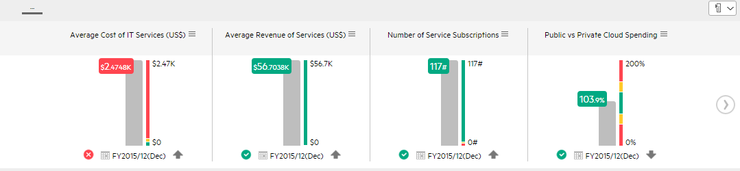
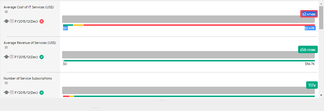
Column format
The graphs display the data horizontally or vertically depending on your format selection.
Note Drilling down to Breakdowns lists a maximum of 15 Breakdowns.
User interface elements are described below (when relevant, unlabeled elements are shown in angle brackets):
|
UI Element |
Description |
|---|---|
| <Columns>
|
The column displays for each item:
|
|
|
Use the arrows to scroll between the "pages" of horizontal columns. The width of the "page" or the number of columns displayed on a "page" depend on the width of the component in the Dashboard. When you get to the leftmost page, the left arrow disappears. When you get to the rightmost page, the right arrow disappears. |
 calculated over the display period.
 indicates that the status is Good.
 indicates that the status is Warning.
 indicates that the status is Error.
 indicates that the status was not calculated or that there was en error in the calculation.

Rolodex - Gauge format
Note Drilling down to Breakdowns lists a maximum of 15 Breakdowns.
The graphs display the data horizontally or vertically depending on your format selection.
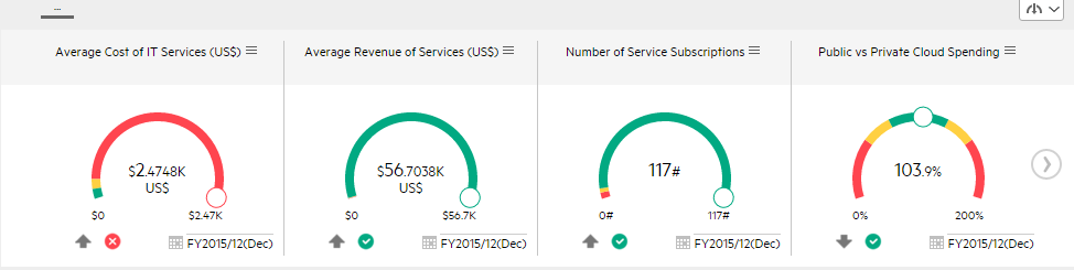
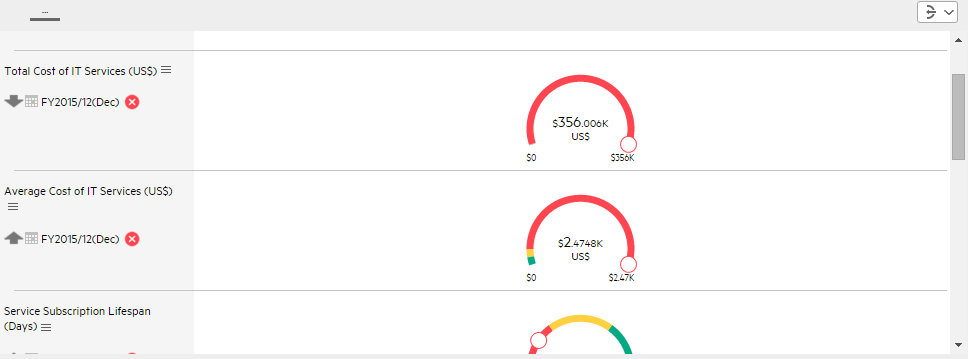
The component displays a gauge for each selected KPI. The order of the gauges in the component, correspond to the order of the KPIs in the Selected KPIs area in the filter dialog box.
User interface elements are described below (when relevant, unlabeled elements are shown in angle brackets):
|
UI Element |
Description |
|---|---|
| <Component contents> |
The component displays the following information:
|
| <Tooltip> | Move the mouse over the name of a KPI to display a tooltip that include additional information about the KPI. For details, see First Level Navigation (FLN) for an Objective, a KPI, or a Metric. |
|
|
Use the arrows to scroll between the "pages" of gauges. The width of the "page" or the number of gauges displayed on a "page" depend on the width of the component in the Dashboard. When you get to the leftmost page, the left arrow disappears. When you get to the rightmost page, the right arrow disappears. |
 is shown at the bottom of the gauge when there is no calculated data for the selected item for the selected period.
This can be due to an incorrect formula (for example: division by zero), an arithmetic error due to missing data, or other reasons.
is shown at the bottom of the gauge when there is no calculated data for the selected item for the selected period.
This can be due to an incorrect formula (for example: division by zero), an arithmetic error due to missing data, or other reasons.
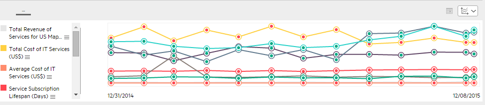
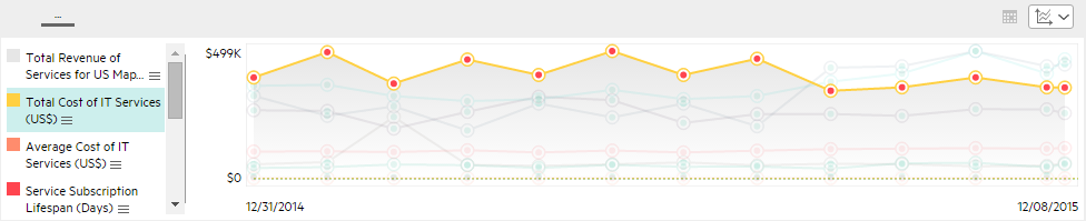
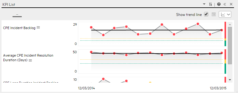
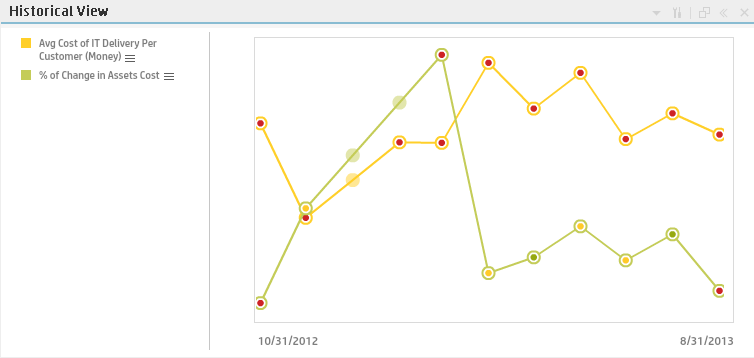
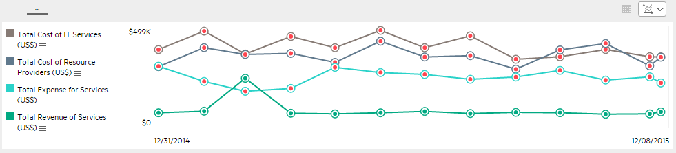
Multiple or single line format
The graphs display the data using multiple lines in a single graph (KPI units permitting) or in a group of one line graphs depending on the format you selected.
User interface elements are described below (when relevant, unlabeled elements are shown in angle brackets):
|
UI Element |
Description |
|---|---|
|
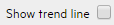
Select to display the trend line for the KPIs or Metrics. The check mark is only available on single line charts. The trend line shows the trend for the relevant time frame.
|
| <Legend> |
The legend displays for each selected item:
|
|
|
Indicates that this item does not have an annotation. Indicates that this item has an annotation. When you move the mouse over such a point, a tooltip displays the annotation information related to the point. For details, see First Level Navigation (FLN) for an Objective, a KPI, or a Metric.
The tooltip displays a maximum of three annotations. If there are more than 3 annotations, the first 2 are displayed followed by Explore.... Click Explore... open the EXPLORER tab in context, to view the whole list of annotations. For details, see About Explorer. Double-click the icon to open the EXPLORER tab filtered for the selected element. |

|
Indicates a point corresponding to a division of the time period selected for the report. The point has the color of the status (green: OK, yellow: warning, and red:critical). Double-click the "point" to display the item 's detailed information in the EXPLORER tab up to the period of time defined by the "point" with the time range corresponding to the item range definition selected in the EXPLORER tab. For details, see About Explorer. Note Click the line in the graph to display a vertical line that provides information about the value of the item. |
| <Threshold> |
The thresholds of the item are displayed on the right of the component. For charts that display a single item, the threshold bar and the dotted line appear by default. For charts that display more than one item, select an item by either clicking the relevant line or the legend item, and the graph will display both the Y-axis and the threshold bar with the dotted line.
|
|
<Y-axis> |
The Y-axis displays the values of the item in the relevant unit and when you selected one chart (
|
|
<X-axis> |
The X-axis displays the time frame selected for the report, split into equal segments, depending on the Display Period. For details, see Pie format. |

 ) when configuring the component:
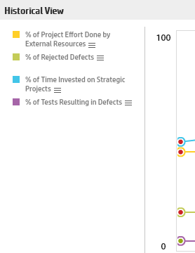
Bar format
Limitation:
- You can only display a maximum of 15 KPIs.
- Drilling down to Breakdowns lists a maximum of 14 Breakdowns. If there are more than 14 Breakdowns, an additional Other bar is displayed and represents the sum of all the other Breakdowns.
- The selected KPIs should have the same units and periodicity.
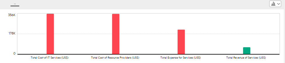
The component displays a bar for each selected item . The order of the bars in the component, correspond to the order of the selected items in the filter dialog box.
User interface elements are described below (when relevant, unlabeled elements are shown in angle brackets):
|
UI Element |
Description |
|---|---|
| <Component contents> |
The component displays the following information:
|
| <Tooltip> | Move the mouse over a bar to display a tooltip that include the value of the item and the name of the item. |
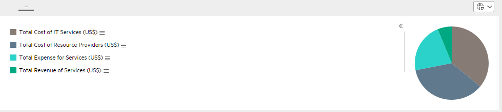
Pie format
Limitation:
- The selected KPIs should have the same units and periodicity.
-
Drilling down to Breakdowns lists a maximum of 14 Breakdowns. If there are more than 14 Breakdowns, an additional "Other" slice is displayed and represents the sum of all the other Breakdowns.
User interface elements are described below (when relevant, unlabeled elements are shown in angle brackets):
|
UI Element |
Description |
|---|---|
| <Pie graph> |
The pie graph displays slices that represent the selected items and show tooltips that display the value of the item and the percentage of the pie.
|
| <Legend> |
Lists one of the following:
|
| <Tooltip> | Move the mouse over the pie slices to display a tooltip that include detailed information about the selected item. |
|
>> << |
Click to display the legend or to hide the legend. |
 icon is displayed.
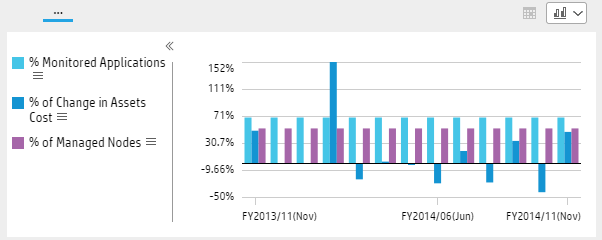
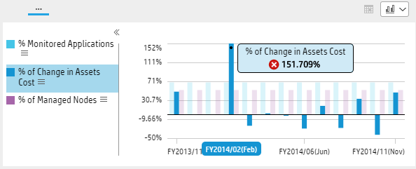
 Cluster Bar format
Limitation:
- The selected KPIs or Metrics should have the same units and periodicity.
- This format can only display the overtime data of up to 15 KPIs or Metrics.
User interface elements are described below (when relevant, unlabeled elements are shown in angle brackets):
|
UI Element |
Description |
|---|---|
| <Cluster bar graph> |
The cluster bar graph displays bars that represent the values of the selected items over time.
|
| <Legend> |
Lists the selected KPIs or Metrics and the color used for the display of their value over time.  Move the cursor above the icon to display the item tooltip that provides detailed information about the item and access to the Explorer in the context of the item. Move the cursor above the icon to display the item tooltip that provides detailed information about the item and access to the Explorer in the context of the item.  when a new annotation has been added to the item. Move the cursor above the icon to display the item tooltip that provides detailed information about the item and access to the Explorer in the context of the item. For details, see First Level Navigation (FLN) for an Objective, a KPI, or a Metric. when a new annotation has been added to the item. Move the cursor above the icon to display the item tooltip that provides detailed information about the item and access to the Explorer in the context of the item. For details, see First Level Navigation (FLN) for an Objective, a KPI, or a Metric. |
| <Tooltip> |
Tooltips display the value of the KPI or Metric for the selected time frame (see above graph for an example). |
| >> or << | Click to display the legend or to hide the legend. |
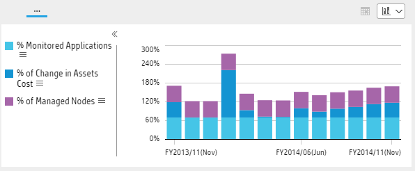
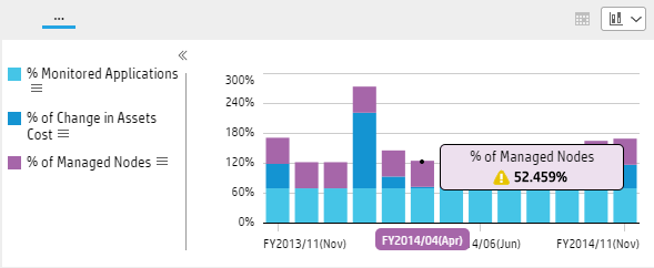
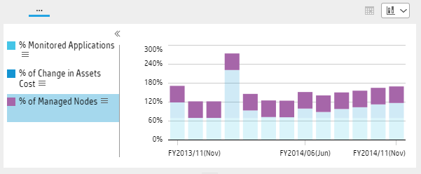
Stacked Bar format
Limitation:
- The selected KPIs or Metrics should have the same units and periodicity.
- This format can only display the overtime data of up to 15 KPIs or Metrics.
User interface elements are described below (when relevant, unlabeled elements are shown in angle brackets):
|
UI Element |
Description |
|---|---|
| <Stacked bar graph> |
The stacked bar graph displays bars that represent the absolute values of the selected items over time.
Hover over the relevant section of the bar to display the overtime values of the KPI or Metric corresponding to the selected section.
|
| <Legend> |
Lists the selected KPIs or Metrics and the color used for the display of their value over time.
Click the relevant KPI or Metric in the legend to display only its bars and values:
Click the breadcrumbs blue line to automatically reselect all the items in the legend. Move the cursor above the icon to display the item tooltip that provides detailed information about the item and access to the Explorer in the context of the item. when a new annotation has been added to the item. Move the cursor above the icon to display the item tooltip that provides detailed information about the item and access to the Explorer in the context of the item. For details, see First Level Navigation (FLN) for an Objective, a KPI, or a Metric. |
| <Tooltip> |
Tooltips display the value of the KPI or Metric for the selected time frame (see above graph for an example). The tooltip displays the value of the KPI or Metric (not the absolute value). |
| >> or << | Click to display the legend or to hide the legend. |
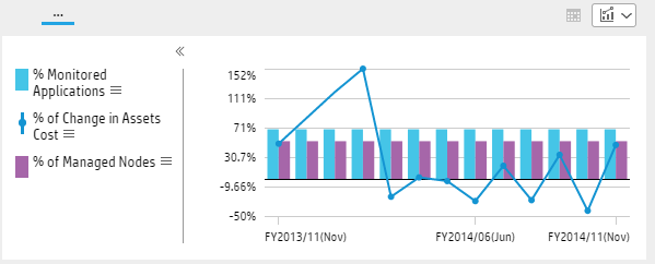
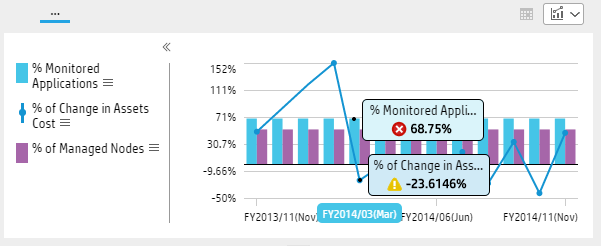
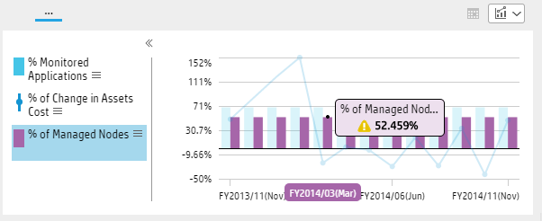
Line and Bar Combination format
Limitation:
- The selected KPIs or Metrics should have the same periodicity.
- This format can only display the overtime data of up to 15 KPIs or Metrics.
User interface elements are described below (when relevant, unlabeled elements are shown in angle brackets):
|
UI Element |
Description |
|---|---|
| Bar and line graph> |
The Bar and Line Combination graph displays bars and lines that represent the values of the selected items over time. When you select the KPIs or Metrics you want to display, the Bar and Line Combination graph displays the first KPI or Metric in the selection alternatively with bars or a line.
Click the relevant bar or line to display the overtime values of the KPI or Metric corresponding to the selected bar or line.
|
| <Legend> |
Lists the selected KPIs or Metrics and the color used for the display of their value over time.
Click the relevant KPI or Metric in the legend to display only its bars or line and values.
Click the breadcrumbs blue line to automatically reselect all the items in the legend. Click the When you have selected only two KPIs or Metrics, the Y-axis is displayed to the left and to the right of the graph. There is no legend. You can toggle between bar and line format for one of the selected KPI or Metric. The other KPI or Metric display format is automatically changed to the other format. Click again the format icon to switch formats.
Move the cursor above the icon to display the item tooltip that provides detailed information about the item and access to the Explorer in the context of the item. when a new annotation has been added to the item. Move the cursor above the icon to display the item tooltip that provides detailed information about the item and access to the Explorer in the context of the item. For details, see First Level Navigation (FLN) for an Objective, a KPI, or a Metric.For details, see First Level Navigation (FLN) for an Objective, a KPI, or a Metric. |
| <Tooltip> |
Tooltips display the value of the KPI or Metric for the selected time frame (see above graph for an example). |
| >> or << | Click to display the legend or to hide the legend. |
 or the
  in the legend to toggle between the bar format and the line format. The selection is persistent.
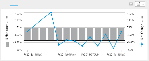
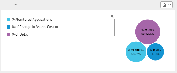
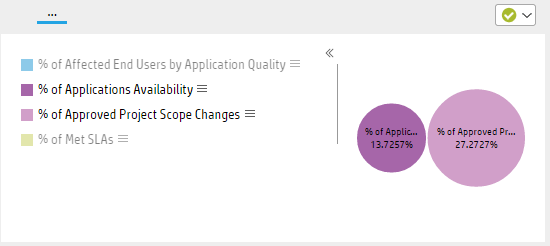
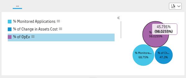
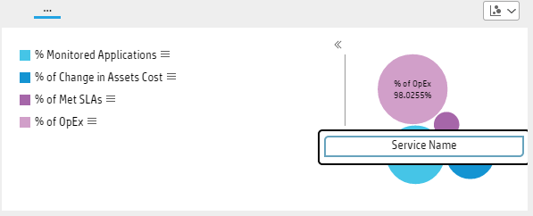
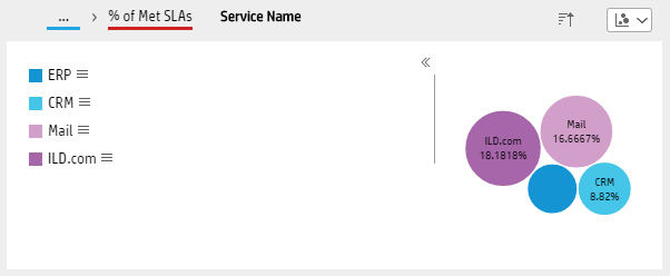
Bubble Chart format
Limitation:
- The selected KPIs or Metrics should have the same units and periodicity.
- This format can only display the overtime data of up to 15 KPIs or Metrics.
-
Drilling down to Breakdowns lists a maximum of 14 Breakdowns. If there are more than 14 Breakdowns, an additional "Other" slice is displayed and represents the sum of all the other Breakdowns.

User interface elements are described below (when relevant, unlabeled elements are shown in angle brackets):
|
UI Element |
Description |
|---|---|
| Bubble chart graph> |
The bubble chart graph displays bubbles. Each bubble includes the name of the corresponding KPI or Metric, the value of the item for the time frame selected in the Filter Display Period field of the component. The size of the bubble corresponds to the absolute value of the corresponding KPI or Metric.
|
| <Legend> |
Lists the selected KPIs or Metrics and the color used for the display of their value over time.
Click the relevant KPI or Metric in the legend to display only its bars or line and values.
Click the breadcrumbs blue line to automatically reselect all the items in the legend. Move the cursor above the icon to display the item tooltip that provides detailed information about the item and access to the Explorer in the context of the item. when a new annotation has been added to the item. Move the cursor above the icon to display the item tooltip that provides detailed information about the item and access to the Explorer in the context of the item. For details, see First Level Navigation (FLN) for an Objective, a KPI, or a Metric.For details, see First Level Navigation (FLN) for an Objective, a KPI, or a Metric. |
| <Tooltip> |
Tooltips display, in the first row, the percentage of the value of the KPI or Metric compared to the rest of the bubbles. The second row displays the value of the item for the time frame selected in the Filter Display Period field of the component.
|
| >> or << | Click to display the legend or to hide the legend. |
| <Breakdowns> |
If one of the selected items has a Breakdown, click on the corresponding bubble to display the item Breakdowns.
Click the Breakdown to display the relevant KPI or Metric Breakdowns.
When you select a Breakdown dimension, the Use the |
List format
User interface elements are described below (when relevant, unlabeled elements are shown in angle brackets):
|
UI Element |
Description |
|---|---|
| List graph> |
The list graph displays each selected KPI or Metric in a list. The row includes:
|
We welcome your comments!
To open the configured email client on this computer, open an email window.
Otherwise, copy the information below to a web mail client, and send this email to SW-Doc@hpe.com.
Help Topic ID:
Product:
Topic Title:
Feedback: