
Searching the Help
To search for information in the Help, type a word or phrase in the Search box. When you enter a group of words, OR is inferred. You can use Boolean operators to refine your search.
Results returned are case insensitive. However, results ranking takes case into account and assigns higher scores to case matches. Therefore, a search for "cats" followed by a search for "Cats" would return the same number of Help topics, but the order in which the topics are listed would be different.
| Search for | Example | Results |
|---|---|---|
| A single word | cat
|
Topics that contain the word "cat". You will also find its grammatical variations, such as "cats". |
|
A phrase. You can specify that the search results contain a specific phrase. |
"cat food" (quotation marks) |
Topics that contain the literal phrase "cat food" and all its grammatical variations. Without the quotation marks, the query is equivalent to specifying an OR operator, which finds topics with one of the individual words instead of the phrase. |
| Search for | Operator | Example |
|---|---|---|
|
Two or more words in the same topic |
|
|
| Either word in a topic |
|
|
| Topics that do not contain a specific word or phrase |
|
|
| Topics that contain one string and do not contain another | ^ (caret) |
cat ^ mouse
|
| A combination of search types | ( ) parentheses |
|


![]()
![]()

- End User - View and Analyze the Business Objectives
- Dashboard
- Change, On-the-fly, the Component Display Format
- Change, On-demand, the Periodicity Used in a Component Display
- Change, On-Demand, the Breakdown Display
- First Level Navigation (FLN) for an Objective, a KPI, or a Metric
- Explorer
- Explorer - Overview
- Explorer - Data Set
- Explorer - Goal Map
- Explorer - Forecast
- Explorer - What If
- Explorer - Annotations
IT Business Analytics provides information regarding the status and values of Objectives, KPIs, or Metrics on the past and current periods in the Dashboard and Explorer tabs. The What-If tab provides a glimpse into the future by forecasting the entity future behavior of the Objective, based on historical data, so you will be able more easily understand the underlying trend and to do all you can now to improve or maintain the desired behavior. In addition, the tab enables you to view the historical, current, and future behavior of the selected Objective.
The capability is available only to Power users (users with the Power Named User License). For details, see Licenses
If the Objective is not set to the current period, the What-If button is disabled.
Click the Explorer tab to access, click the relevant Objective, and click the What-Ifbutton.

 Calculation method for the Score
The score that is displayed in the title of the tab is calculated using the default values of the Objective child KPIs. The calculated score, displayed inside the tab on the left-hand side, uses an algorithm that basically takes the “new” values of the KPI and calculates the updated score of the objective and presents that information, on-the-fly.
Calculation method for forecast
The correctness of the forecast calculation is based on the historical data of the entity and is calculated using the DoubleExponentialSmoothingModel algorithm. The more data there is the more precise the forecast is.
• ft = a.Yt+(1-a)(ft-1+bt-1)
• bt = g.(ft-ft-1)+(1-g).bt-1
where:
• Yt is the observed value at time t.
• ft is the forecast at time t.
• bt is the estimated slope at time t.
• a - (alpha) - is the first smoothing constant, used to smooth the observations. Its value is: 0.6.
• g - (gamma) - is the second smoothing constant, used to smooth the trend. Its value is: 0.6.
To forecast:
ft+m= ft+ mbt-m
where m=1 (The time interval).
The initial point is: f1=y1; b1=y2-y1
Minimum historical data
The best forecasts are based on a large amount of historical data.
To provide the best forecast using the above algorithm, the calculation relies on as much historical data as is available. The following table indicates what are the minimum historical periods needed to calculate a certain future period.
| Future Period | Minimum historical data to calculate single future period |
Maximum period possible for this periodicity |
Maximum historical data to calculate maximum future period |
|---|---|---|---|
| 1 day | 30 days | 14 days | 420 days |
| 1 week | 12 weeks | 4 weeks | 48 weeks |
| 1 month | 12 months | 3 months | 36 months |
| 1 quarter | 6 quarters | 3 quarters | 18 quarters |
| 1 year | 3 years | 3 years | 9 years |
Limitations
If you select a forecast period that cannot be calculated due to the lack of data, the error message You do not have enough valid historical data to calculate the forecast or you do not have the correct viewing permissions. Contact your administrator is issued, and the forecast calculation is not performed. When the historical data is less than the value of the Minimum historical data to calculate single future period, the Forecast is not calculated.
So for a yearly KPI, only when the historical data is less than 3 years, there will be insufficient data to calculate a 3 years, 2 years, and 1 years forecast.

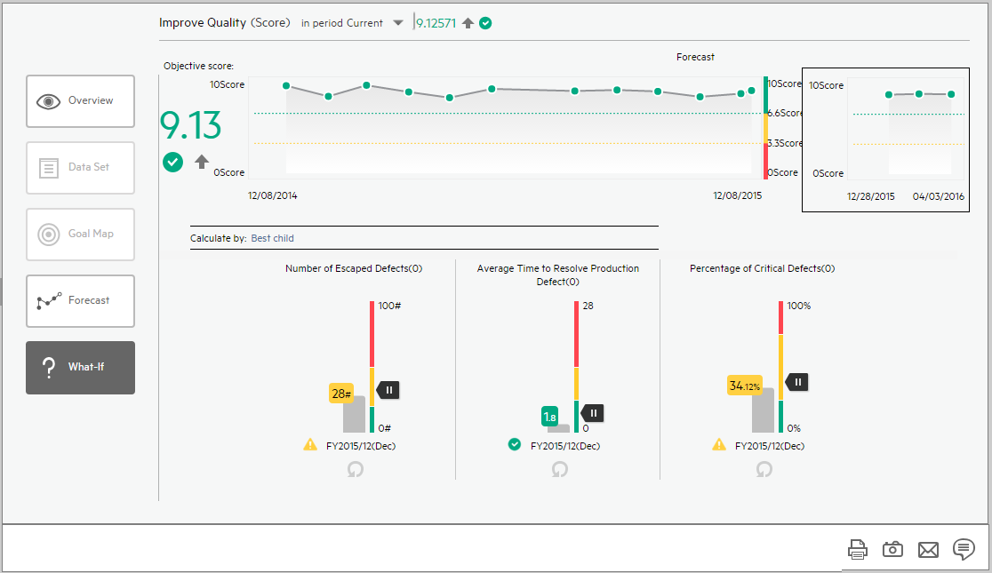
View the What-If of an Objective
To view the What-If of an Objective:
- As a Power user with the Forecast permission, click Explorer.
-
Select the relevant Objective in the Active KPIs pane, and click What-If.
-
The historical view of the Objective appears alongside the forecast. (The forecast is calculated using the DoubleExponentialSmoothingModel algorithm described above).
-
Beneath the historical view, you can view details about the Objective child KPIs, their thresholds, and values.
-
You can drag the
 pointer of a KPI up or down to adjust it to the value you want to check and to view the change in score and forecast on-the-fly.
Once you finish dragging the pointer, the score and the Forecast graph are updated.
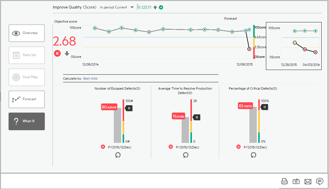
-
The display maintains the current forecast graph (pale green line) with the new forecast graph (black line) based on the changed values to enable you to compare between the current forecast and the What-If forecast.
-
You can change the values of other child KPIs and watch how that changes the score and graph.
-
To go back to the original values, click the
 Reset to default button for each child KPI.
Note
- The changes to the values of the KPIs in the What-If tab are reset any time you leave the page.
- The What-If page displays data only when Current is selected in the in period <period> in the title of the page.

The Explorer - What-If page includes the following areas:
What-If page
User interface elements are described below (when relevant, unlabeled elements are shown in angle brackets):
|
UI Element |
Description |
|---|---|
|
|
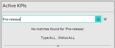
Enter the relevant string to display, in the tree, the nodes whose name includes the string. In addition, the child nodes of the filtered nodes are also listed even when the child node names do not include the string. If the display is filtered (in case you accessed the Explorer from one of the components in the Dashboard), the <Search> box displays information about the filter. For example:
|

|
Advanced Search. Opens additional fields to help you refine the component's filter:
|
| Active KPIs |
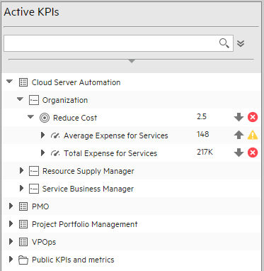
Depending on how you accessed the Explorer tab, the pane lists all the Scorecards, Perspectives, Objectives, KPIs, KPI Breakdowns, Metrics, Metric Breakdowns, and Unassigned KPIs, active in the IT Business Analytics or a subset of these items. The list of Scorecards that is displayed corresponds to the Scorecards that are permitted for your user. For details about permissions, see User Management Note A Scorecard Administrator who wants to see a newly created Scorecard in Explorer (and who has the correct permissions to see the Scorecard), needs to refresh the Explorer using the Refresh button to display the Scorecard. Click one of the Scorecards, Perspectives, Objectives, KPIs, KPI Breakdowns, Metrics, Metric Breakdowns, or Unassigned KPIs to display their detailed information in the other pane. The area also displays on the right side of the Active KPIs pane, a subset of the following items depending on the type of item you selected:
|
 <Search>
 The trend icon indicates the trend of the value calculated over the current period.
 indicates that the status is Good.
 indicates that the status is Warning.
 indicates that the status is Critical.
 indicates that the status is Pending and that the calculations have not yet been performed or completed.
The display of the What-If for a specific Objective depends on the user permission for the Objective.
User interface elements are described below (when relevant, unlabeled elements are shown in angle brackets):
|
UI Element |
Description |
|---|---|
| <Name> in period <Selection> <Score> <Trend> <Status> |
The title lists:
|
| Objective Score |
Details about the Objective Score. |
| <Graph format> |
|
| Calculate by | The type of calculation used to calculate the score of the Objective. For details, see About Active Objectives. |
| <Child KPIs> |
Graphs that present the Objective child KPIs details:
Note The changes to the values of the KPIs in the What-If tab are reset any time you leave the page. |

 indicates that the status is Pending or No data, meaning that the calculation of the status was not yet completed or the status was not calculated or that there was en error in the calculation.
  Indicates a regular "point" corresponding to a division of the time period.
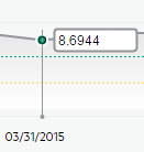
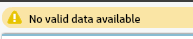 is shown at the top of the display when there is no calculated data for the selected item for the selected period.
This can be due to an incorrect formula (for example: division by zero), an arithmetic error due to missing data, or other reasons.
is shown at the top of the display when there is no calculated data for the selected item for the selected period.
This can be due to an incorrect formula (for example: division by zero), an arithmetic error due to missing data, or other reasons.
 Indicates a regular "point" corresponding to a division of the time period.
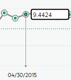
User interface elements are described below (when relevant, unlabeled elements are shown in angle brackets):
|
UI Element |
Description |
|---|---|

|
Send mail. Opens an Outlook email, with the name of the selected entity in the Subject box. |

|
Save snapshot. Captures the current view in Explorer (all of it) in a new window. A dialog box opens to ask you where you want to save the image. |

|
Print. Displays the Print dialog box where you can select the printer and how to print the content of the corresponding Explorer tab. The printout includes:
|

|
Show/Hide Annotations. The button is enabled only for Objectives, KPIs, KPI Breakdowns, Metrics, Metric Breakdowns, or Unassigned KPI. It opens a box where you can add your annotation or hide them after viewing. For details, see Annotations. Click the button again to close the Annotation area. Note The Show/Hide Annotations icon with a little + sign |
 in the bottom toolbar indicates that a new annotation was added to the selected item during the past week.
We welcome your comments!
To open the configured email client on this computer, open an email window.
Otherwise, copy the information below to a web mail client, and send this email to SW-Doc@hpe.com.
Help Topic ID:
Product:
Topic Title:
Feedback: