
Searching the Help
To search for information in the Help, type a word or phrase in the Search box. When you enter a group of words, OR is inferred. You can use Boolean operators to refine your search.
Results returned are case insensitive. However, results ranking takes case into account and assigns higher scores to case matches. Therefore, a search for "cats" followed by a search for "Cats" would return the same number of Help topics, but the order in which the topics are listed would be different.
 Words and Phrases
| Search for | Example | Results |
|---|---|---|
| A single word | cat
|
Topics that contain the word "cat". You will also find its grammatical variations, such as "cats". |
|
A phrase. You can specify that the search results contain a specific phrase. |
"cat food" (quotation marks) |
Topics that contain the literal phrase "cat food" and all its grammatical variations. Without the quotation marks, the query is equivalent to specifying an OR operator, which finds topics with one of the individual words instead of the phrase. |
Using Boolean Operators
| Search for | Operator | Example |
|---|---|---|
|
Two or more words in the same topic |
|
|
| Either word in a topic |
|
|
| Topics that do not contain a specific word or phrase |
|
|
| Topics that contain one string and do not contain another | ^ (caret) |
cat ^ mouse
|
| A combination of search types | ( ) parentheses |
|


- Prepare the Dashboard Display
- Dashboard Page
- Page Layout and Components
- Page Gallery and Page Categories
- Component Gallery and Component Categories
- The Breakdown View Component
- The Bubble Chart View Component
- The Cluster Bar Chart View Component
- The Forecast Component
- The Historical Metric View Component
- The Historical View Component
- The KPI List Component
- The KPI Rolodex Component
- The KPI View Component
- The Line and Bar Combination Chart View Component
- The Page Filter Component
- The Pie Chart Component
- The Scorecard Component
- The Stacked Bar Chart View Component
- The SWF Report Viewer Component
- The US Map Component
- The Web Intelligence Report Viewer Component
- The Web Intelligence Static Report Viewer Component
- Webi Report Categories
- The World Map Component
- The Xcelsius Reports Viewer (Flash) Component
- Customized Static or Dynamic URL Component
- Wiring Between Components
- Personalize the Dashboard
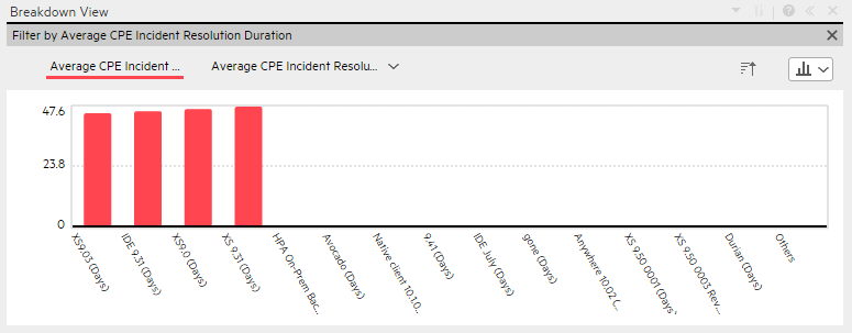
The Breakdown View component enables the user to view the values of the KPI Breakdown for the KPI you select in the KPI View, Historical View, or Rolodex component in the same Dashboard page.
You can view the report in the relevant page in the Dashboard.

Tip A Breakdown View component displays only one KPI Breakdown. If you want to display more than one KPI Breakdown in the Dashboard page, you can create multiple Breakdown View components and rename each component.
Permissions
Permissions. In the Dashboard components and in their configuration dialog boxes, you can only see the Scorecards, Perspectives, Objectives, KPIs, or KPI Breakdowns for which you have permission. If you do not have permission, you do not see that element. If you do not have permission to see all the elements in a component, the error message Data is not displayed because it does not exist or you do not have the correct viewing permissions. Contact your administrator is displayed.
Wiring
Wiring. Wiring is between components. It does not depend on the component internal format. For details, see Wiring Between Components.
If you drill down (to Breakdowns) in a specific component that is wired to another component on the same page, and you click the triggering component, the component with the Breakdowns is restored to its top level and filtered according to the triggering component.
The Breakdown View component is automatically wired to the KPI View, Historical View, and KPI Rolodex component that appear on the same Dashboard page. This means, that when you select a KPI in the KPI View component, its KPI Breakdowns are listed in the Breakdown List and you can select to display the relevant one. You cannot configure the Breakdown View component.
The Historical View component is automatically wired to the Breakdown View component and to the Forecast component. For details, see The Breakdown View Component and The Forecast Component.

Main task: Dashboard Display
Display a KPI Breakdown Values
To display a KPI Breakdown values in a component on a Dashboard page, proceed as follows:
- Prerequisite: Make sure that the KPI has the relevant KPI Breakdowns. For details, see KPI Breakdowns.
- In the Executive Dashboard, select the relevant page (click the Page Gallery
 button if the page you want does not already appear in the Dashboard).
 - Add the Breakdown View component to the page. For details, see Create a Dashboard Page and Add Components to the Page
- Optionally, add the KPI View, Historical View, or KPI Rolodex component to the page. These components are automatically wired to the Breakdown View component.
-
In the Breakdown View component, select the chart display type ,Top10 or Bottom 10, and the KPI Breakdown you want to display. For details, see Breakdown View Component.
The component displays the required information.
- Save the page.

Breakdown View Component
Important:
- The Breakdown View component is automatically wired to the KPI View, Historical View, and KPI Rolodex component that appears on the same Dashboard page. This means, that when you select a KPI in the KPI View component, its KPI Breakdowns are listed in the Breakdown List and you can select to display the relevant one. You cannot configure the Breakdown View component.
-
Note To display data in the Metric Breakdown report in an Xcelsius component or in a Metric Breakdown component, you must add the Historical Metric View component to the page . When you click the graph of a specific Metric in the Historical Metric View component, the list of its Metric Breakdowns is displayed in the Metric Breakdown report list. You can then display the relevant Metric Breakdown information.
Note The component toolbar description is common to all components. Some of the elements might be disabled in some of the components.
User interface elements are described below (when relevant, unlabeled elements are shown in angle brackets):
|
UI Element |
Description |
|---|---|

|
Component Menu. Opens a menu where you can select:
|

|
Configure Component. Opens the Configure Component dialog box for the relevant component. For details, see the relevant section below. Note
Note You can also click here in Click Here to configure it in the center of the component |

|
Opens the online documentation page relevant to the component you are currently configuring. |

|
Collapse component. Collapses the component. To expand the collapsed component, click the |

|
Drag the Resize handle to enlarge or reduce horizontally the area occupied by the component. |

|
Remove Component. Removes the component from the page. |
 Preferences. Depending on the component you are current configuring, opens the <component_name> Preferences dialog box where you can change the name of the component in the page by changing the name in the Name field and clicking OK.
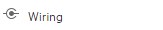 Wiring. Depending on the component you are currently configuring, opens the Wiring dialog box where you can wire the current component to other components. For details, see
  Refresh. Refreshes the display. The button is disabled in the Page Filter component.
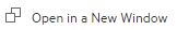 Open in a New Window. Opens the component in a new window.
 button on the collapsed component.
User interface elements are described below (when relevant, unlabeled elements are shown in angle brackets):
Note Some of the graphs below display thresholds. When the selected item is a Metric (that does not have thresholds), the graph displays the data without the threshold element.
|
UI Element |
Description |
|---|---|
| <Breadcrumbs> |
Note Breadcrumbs are displayed only in specific components. When you have selected a Breakdown (see below for more details), the breadcrumb displays the level of the displayed element:
Click the relevant item in the breadcrumb list to go back to a previous level. |

|
Enables the on-demand periodicity temporary recalculation and display. For details, see On-demand Periodicity in Component Display. |
|
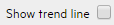
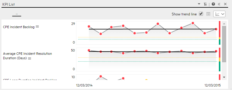
Only available in single line format. Select the button to display the trend line for the relevant time frame.
|
<Display format>

|
You can modify the format of the display of some of the components on the fly, by selecting the relevant format. Some of the formats are not applicable to some of the components. The formats you can select are:
For details, see On-the-fly Display Format Change in Dashboard Page Components. |
| <Breakdowns> |
The cursor changes from an arrow to a hand indicates that the displayed item has a Breakdown. Click the displayed item to list the available Breakdowns:
Click the relevant Breakdown to display its information using the same format as its parent. You can then select another format by selecting it from the <Display format> list. For details, see Change, On-Demand, the Breakdown Display. |

 - To display the contents of the component using the enriched vertical column format. For details, see
  - To display the contents of the component using the horizontal Rolodex or gauge format. For details, see
  - To display the content using the multiple line format. For details, see
  - To display the content using the pie format. For details, see
  - To display the content using the bar format. For details, see
  - To display the content using the horizontal enriched column format. For details, see
  - To display the content using the vertical Rolodex or gauge format. For details, see
  - To display the content using the single line graph format. For details, see
  - To display the content using the cluster bar format. For details, see
  - To display the content using the stacked bar format. For details, see
  - To display the content using the bar and line format. For details, see
  - To display the content using the bubble chart format. For details, see
  - To display the content using the list format. For details, see
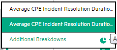
We welcome your comments!
To open the configured email client on this computer, open an email window.
Otherwise, copy the information below to a web mail client, and send this email to SW-Doc@hpe.com.
Help Topic ID:
Product:
Topic Title:
Feedback: