
Searching the Help
To search for information in the Help, type a word or phrase in the Search box. When you enter a group of words, OR is inferred. You can use Boolean operators to refine your search.
Results returned are case insensitive. However, results ranking takes case into account and assigns higher scores to case matches. Therefore, a search for "cats" followed by a search for "Cats" would return the same number of Help topics, but the order in which the topics are listed would be different.
 Words and Phrases
| Search for | Example | Results |
|---|---|---|
| A single word | cat
|
Topics that contain the word "cat". You will also find its grammatical variations, such as "cats". |
|
A phrase. You can specify that the search results contain a specific phrase. |
"cat food" (quotation marks) |
Topics that contain the literal phrase "cat food" and all its grammatical variations. Without the quotation marks, the query is equivalent to specifying an OR operator, which finds topics with one of the individual words instead of the phrase. |
Using Boolean Operators
| Search for | Operator | Example |
|---|---|---|
|
Two or more words in the same topic |
|
|
| Either word in a topic |
|
|
| Topics that do not contain a specific word or phrase |
|
|
| Topics that contain one string and do not contain another | ^ (caret) |
cat ^ mouse
|
| A combination of search types | ( ) parentheses |
|


- Prepare the Dashboard Display
- Dashboard Page
- Page Layout and Components
- Page Gallery and Page Categories
- Component Gallery and Component Categories
- The Breakdown View Component
- The Bubble Chart View Component
- The Cluster Bar Chart View Component
- The Forecast Component
- The Historical Metric View Component
- The Historical View Component
- The KPI List Component
- The KPI Rolodex Component
- The KPI View Component
- The Line and Bar Combination Chart View Component
- The Page Filter Component
- The Pie Chart Component
- The Scorecard Component
- The Stacked Bar Chart View Component
- The SWF Report Viewer Component
- The US Map Component
- The Web Intelligence Report Viewer Component
- The Web Intelligence Static Report Viewer Component
- Webi Report Categories
- The World Map Component
- The Xcelsius Reports Viewer (Flash) Component
- Customized Static or Dynamic URL Component
- Wiring Between Components
- Personalize the Dashboard
The Page Filter component enables the Executive User to filter the KPI/Metric Breakdowns displayed in the components of the page.
You can view the component in the relevant page in the Dashboard.
To configure the component, where possible, click the Configure Component  button in the component to display the component filter, or click here in Click Here to configure in the center of the component.

Permissions
Permissions. In the Dashboard components and in their configuration dialog boxes, you can only see the Scorecards, Perspectives, Objectives, KPIs, or KPI Breakdowns for which you have permission. If you do not have permission, you do not see that element. If you do not have permission to see all the elements in a component, the error message Data is not displayed because it does not exist or you do not have the correct viewing permissions. Contact your administrator is displayed.
Wiring
The Page Filter component is automatically wired with the following components when these components are on the same Dashboard page:
- Historical Metric View component. For details, seeThe Historical Metric View Component.
- Historical View component . For details, seeThe Historical View Component.
- KPI View component. For details, see The KPI View Component.
- KPI List component . For details, see The KPI List Component.
- KPI Rolodex component. For details, seeThe KPI Rolodex Component.
- Xcelsius Report Viewer Flash component. For details, see The Xcelsius Reports Viewer (Flash) Component.
- Web Intelligence Report Viewer component. For details, seeThe Web Intelligence Report Viewer Component.
- Pie Chart component. For details, seeThe Pie Chart Component.
-
Bubble Chart component. For details, see The Bubble Chart View Component.
-
Cluster Bar Chart View component. For details, see The Cluster Bar Chart View Component.
-
Stacked Bar Chart View component. For details, see The Stacked Bar Chart View Component.
-
Line and Bar Combination Chart View component. For details, see The Line and Bar Combination Chart View Component.
You can also set up wiring between components. For additional information about wiring, see Wiring Between Components.
Important Information
All the time periods used in the component are periods of the fiscal year (For example, the end of the fiscal year depends on the fiscal year you have set at the system level).
Tip If you want to view a page filtered by specific dimensions every time you open it, even if other users have viewed the page and selected other dimensions, proceed as follows:
- Create the page and include a Page Filter component with the relevant Breakdowns.
- Save the page.
Each user opens the page for the first time, selects the relevant dimensions, and collapse the component. The user leaves the page without saving it.
When the user reopens the page, the selected dimensions are restored for that user even if other users entered the page and selected different dimensions.
If needed, the user can then expand the component and change the selection.

Main task: Dashboard Display
Add the Component to a Dashboard Page
To add a component to a page that is already formatted:
- In the Dashboard, select the relevant page (click the Page Gallery
 button if the page you want does not already appear in the Dashboard).
 - Click the Components
 button.
 -
In the Component Gallery page that opens, click or double-click the component to place it in the layout area, or select the component and drag it to an area on the page.
Note that double-click only works if you open the Component Gallery from the layout itself and not from the toolbar.
- If the target area is hidden by the Component Gallery dialog box, click the Component Gallery dialog box title bar and drag it to another location on your screen.
- If you are dragging a new component to a target area that already has a component defined, drag the new component to the title bar of the target area, and not to the part of the component that is colored white.
-
Close the Component Gallery page. For user interface details, see Component Gallery and Component Categories.
-
In the component, click the Configure Component
button or click here in Click Here to configure in the center of the component. -
In the component Filter dialog box that opens, select the information you want to display and click OK.
The component displays the required information.
For more information, see Page Layout and Components.
Use Case - Filter Component in a Dashboard Page
In this section, you will learn how to filter the different Dashboard components and how to present the filtered data in a Dashboard page.
You have 2 main options to filter the data presented in the components:
- You can filter each component separately by clicking the Configure Component icon and setting the component configuration according to the support settings.
- You can use the Page Filter component. When you use this component, each selection you make in the Page filter, impacts all the other components in the page.
To filter using the Page Filter component:
- In the Executive Dashboard, select the relevant page (click the Page Gallery button if the page you want does not already appear in the Dashboard).
- Click the Components button.
-
In the Component Gallery dialog box that opens, double-click the Page Filter component (for details, see The Page Filter Component) to place it in the layout area, or select the component and drag it to an area on the page, and close the Component Gallery page. For details, see Component Gallery Dialog Box.
- If the target area is hidden by the Component Gallery dialog box, click the Component Gallery dialog box title bar and drag it to another location on your screen.
- If you are dragging a new component to a target area that already has a component defined, drag the new component to the title bar of the target area, and not to the part of the component that is colored white.
-
Close the Component Gallery dialog box.
-
The basic configuration of the Page Filter component includes the Period filter. Select a time period and click the Filter button and all the data of the components located on the same page, is filtered automatically based on the selection you made.
- You can add additional fields to the component and filter the page according to them. To do so, click the Configure Component icon. A list of available dimensions appears in the Available dimensions pane. Those dimensions are created based on the KPI or Metric Breakdown configurations you set earlier in the Studio.
-
Select one of more dimensions and move them to the Selected dimensions area.
-
Click OK. The new dimensions appear in the Page Filter and you or the Executive user can use them to refine, in addition to the time period, the filtering of the other components of the page.
-
To clean the filter selection, click the Clean filter option.
-
Once you filter the page according to your needs, click Save.
Movie: To display the relevant movie, open the ITBA application, click Help in the top right corner of the application main page and select the Movies option. Select the relevant movie. For details, see Access Movies.

Page Filter Component (Display) Dialog Box
The component displays the period you can select, and the KPI/Metric Breakdowns you can select to filter the other components of the page.
Tip It is important to have configured KPI Breakdowns or Metric Breakdowns before you add the Page Filter component to a Dashboard page. For details, see KPI Breakdowns or Metric Breakdowns.

Note The component toolbar description is common to all components. Some of the elements might be disabled in some of the components.
User interface elements are described below (when relevant, unlabeled elements are shown in angle brackets):
|
UI Element |
Description |
|---|---|

|
Component Menu. Opens a menu where you can select:
|
|
|
Configure Component. Opens the Configure Component dialog box for the relevant component. For details, see the relevant section below. Note
Note You can also click here in Click Here to configure it in the center of the component |

|
Opens the online documentation page relevant to the component you are currently configuring. |

|
Collapse component. Collapses the component. To expand the collapsed component, click the |

|
Drag the Resize handle to enlarge or reduce horizontally the area occupied by the component. |

|
Remove Component. Removes the component from the page. |
 Preferences. Depending on the component you are current configuring, opens the <component_name> Preferences dialog box where you can change the name of the component in the page by changing the name in the Name field and clicking OK.
 Wiring. Depending on the component you are currently configuring, opens the Wiring dialog box where you can wire the current component to other components. For details, see
  Refresh. Refreshes the display. The button is disabled in the Page Filter component.
 Open in a New Window. Opens the component in a new window.
 button on the collapsed component.
User interface elements are described below (when relevant, unlabeled elements are shown in angle brackets):
|
UI Element |
Description |
|---|---|
| Period |
Select the display period type. It can be Last Closed, Current, Weekly, Quarterly, Monthly, or Yearly. If you select a specific period type, all the KPIs and Metrics with a periodicity that is different from the selected periodicity show No data. The values that are displayed correspond to the periods used when the engine runs calculations. If the engine has not yet run calculations this field is empty. Once you select one of the Weekly, Quarterly, Monthly, or Yearly display period types, another field opens where you can select the specific period corresponding to that type. Example If you select Quarterly, you can select FY2011/Q1, FY2011/Q2, FY2011/Q3, or FY2011/Q4. The period you select replaces the display period of all the Dashboard page components wired to the Page Filter component and causes a refresh of the relevant components on the page when you click Filter. |
| <entity:dimension> |
Each entity and dimension that you selected in the Page Filter - Configure Component Dialog Box is displayed in the Page Filter and the dropdown box displays the list of values that you selected for each entity and dimension. When a large number of entity:dimensions are selected, a scrollbar is automatically displayed. The values of the entity:dimension you select replace the entity and dimensions you selected for all the Dashboard page components wired to the Page Filter component and causes a refresh for the relevant elements in the components when you click Filter. |
| Filter | Click to filter the page wired components with the selections you made in the Page Filter. |
| Clear | Click to clear the selections you made. |
Page Filter - Configure Component Dialog Box

User interface elements are described below (when relevant, unlabeled elements are shown in angle brackets):
|
UI Element |
Description |
|---|---|
| Available dimensions |
The list of entities and dimensions corresponding to the KPI Breakdowns or Metric Breakdowns that were defined in the Studio. |
|
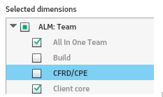
Selected dimensions
|
The list of entities and dimensions you selected using the arrows. You can then select the values of the dimensions you want to include in the filter. You can also exclude a specific value from the filter by not selecting it. You can also globally select or deselect a dimension values by clicking the check box at the level of the dimension. You can then select or deselect the dimension values you want or do not want to include in the filter. If only some of the dimension values are selected or deselected, the check box at the level of the dimension is partially filled in:
|

|
Select an entity and dimension in the Selected dimensions tree to move it up or down in the tree. The order of the selected entities and dimensions is the order displayed in the Page Filter. To view the information, you must have defined the correct KPI/Metric Breakdowns. Example If the tree of KPIs and KPI Breakdowns is:
If, in the Page Filter - Configure Component dialog box, you select Organization and then Location, the Page filter shows two drop downs: Organization and Location. If you select a value in Organization and a value in Location, the wired components are filtered according to the values you selected. If you do not select a value in Organization but select a value in Location, the KPI Breakdowns in the wired components display No data. To prevent this problem, it is recommended to also define the other combination of entities and dimensions as follows:
|
We welcome your comments!
To open the configured email client on this computer, open an email window.
Otherwise, copy the information below to a web mail client, and send this email to SW-Doc@hpe.com.
Help Topic ID:
Product:
Topic Title:
Feedback: