
Searching the Help
To search for information in the Help, type a word or phrase in the Search box. When you enter a group of words, OR is inferred. You can use Boolean operators to refine your search.
Results returned are case insensitive. However, results ranking takes case into account and assigns higher scores to case matches. Therefore, a search for "cats" followed by a search for "Cats" would return the same number of Help topics, but the order in which the topics are listed would be different.
 Words and Phrases
| Search for | Example | Results |
|---|---|---|
| A single word | cat
|
Topics that contain the word "cat". You will also find its grammatical variations, such as "cats". |
|
A phrase. You can specify that the search results contain a specific phrase. |
"cat food" (quotation marks) |
Topics that contain the literal phrase "cat food" and all its grammatical variations. Without the quotation marks, the query is equivalent to specifying an OR operator, which finds topics with one of the individual words instead of the phrase. |
Using Boolean Operators
| Search for | Operator | Example |
|---|---|---|
|
Two or more words in the same topic |
|
|
| Either word in a topic |
|
|
| Topics that do not contain a specific word or phrase |
|
|
| Topics that contain one string and do not contain another | ^ (caret) |
cat ^ mouse
|
| A combination of search types | ( ) parentheses |
|


- Prepare the Dashboard Display
- Dashboard Page
- Page Layout and Components
- Page Gallery and Page Categories
- Component Gallery and Component Categories
- The Breakdown View Component
- The Bubble Chart View Component
- The Cluster Bar Chart View Component
- The Forecast Component
- The Historical Metric View Component
- The Historical View Component
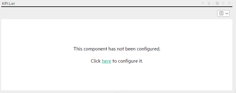
- The KPI List Component
- The KPI Rolodex Component
- The KPI View Component
- The Line and Bar Combination Chart View Component
- The Page Filter Component
- The Pie Chart Component
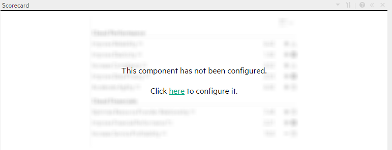
- The Scorecard Component
- The Stacked Bar Chart View Component
- The SWF Report Viewer Component
- The US Map Component
- The Web Intelligence Report Viewer Component
- The Web Intelligence Static Report Viewer Component
- Webi Report Categories
- The World Map Component
- The Xcelsius Reports Viewer (Flash) Component
- Customized Static or Dynamic URL Component
- Wiring Between Components
- Personalize the Dashboard
You can view default pages and create new pages containing components using the Dashboard workspace . Each page is displayed as a tab within the workspace.
Dashboard is displayed when you log on IT Business Analytics. You can also access the display by closing the other tabs.

- For a list of default pages, see Dashboard.
- ITBA includes default components. For a list of default components, see Dashboard Display.

Configure a Page Layout
In the Dashboard, in the relevant page tab, you can configure how the components are displayed.
You can configure the page with:
- A horizontal layout (the components are displayed side by side)
- A vertical layout (the components are displayed one above the other).
- A combination of horizontal and vertical layout.
- Tabs (the components are displayed in tabs inside the layout itself).
It is recommended that you plan in advance which components you want to place on your page and how they should be arranged, and then configure your page layout accordingly.
Create a Dashboard Page and Add Components to the Page
The following section provides an example of how an administrator configures the layout of components on a page.
It is recommended that you plan in advance which components you want to place on your page and how they should be arranged, and then configure your page layout accordingly
- In the application, close all tabs to open the Dashboard.
-
Click the New Page
 button in the Dashboard toolbar or in the middle of the page. An empty page appears.
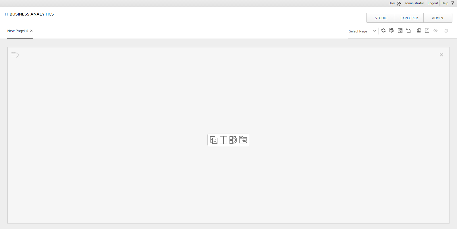
For more details, see Dashboard Page .
-
Click
 to split the page into two horizontal sections.
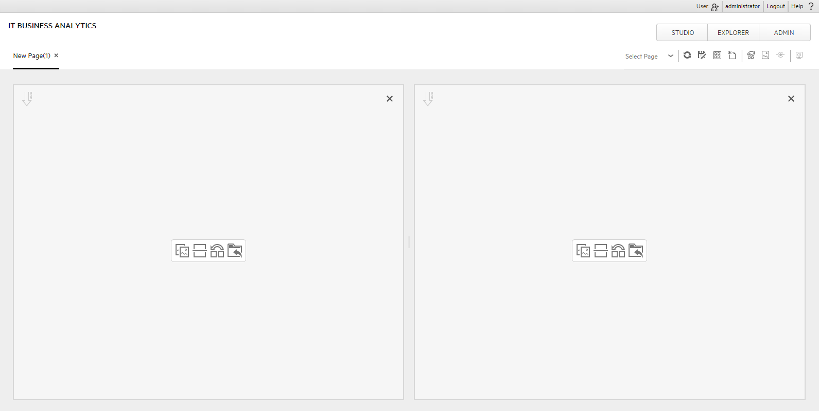
The horizontal layout displays the sections side-by-side.
-
The split icon is now horizontal. Click
 on the left side to split the column vertically into two sections.
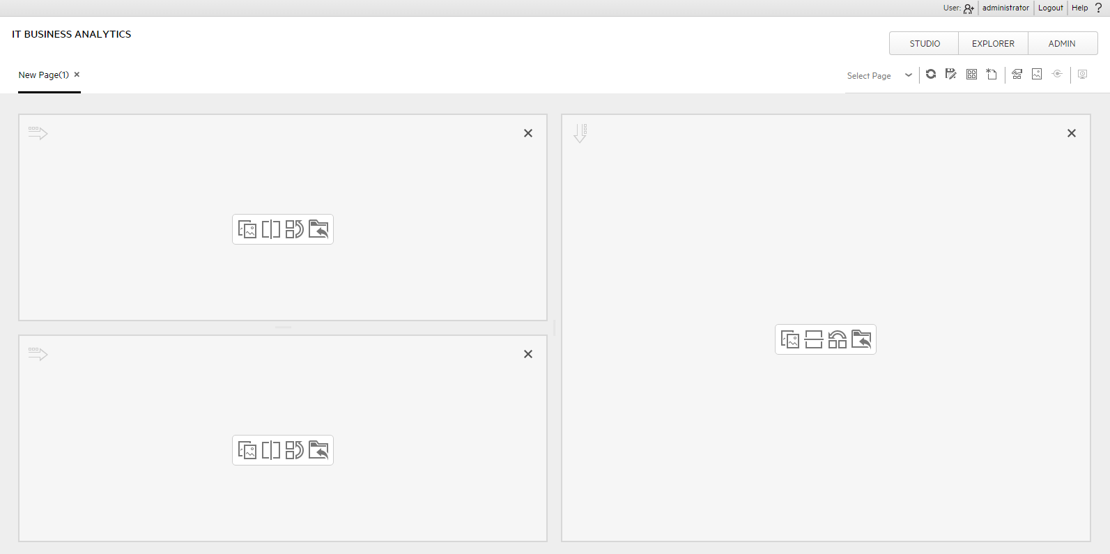
-
In the same way, click
to split the second column vertically into two vertical sections.The page now includes 4 sections:
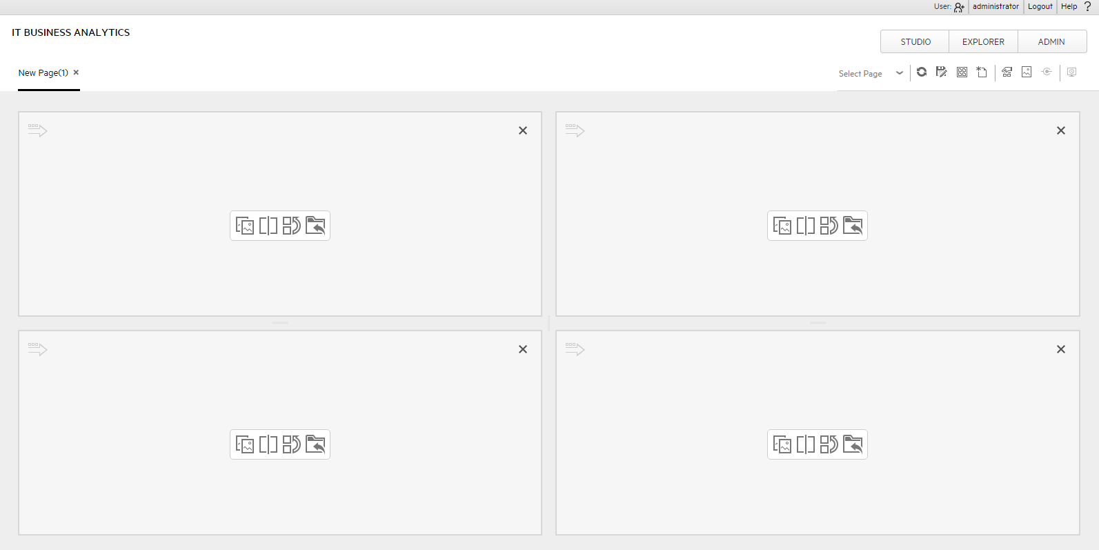
- Now, add components to the page layout you created.
- Click the ‘Add component’ icon in one of the areas, or click the Component Gallery
 button in the top right menu bar to open the Components dialog box.
 - In the Component Gallery page that opens, double-click the component to place it in the layout area, or select the component and drag it to an area on the page, and close the Component Gallery page.
-
Select the component you want to add to one of the areas you created, and drag it to that area. Do the same for all the other areas.
For more details, see Component Gallery and Component Categories .
- For a Tab area, drag the components you wish to add and for each component a new tab will appear.
-
After adding the relevant components to the relevant areas, save the page by clicking the Save icon. Enter a page name, add a description, and decide under which category the page will be saved. If you do not select a category, the page is saved in the Non Categorized category.
For more details, see Create a Dashboard Page and Add Components to the Page .
Note To remove an area click the Remove Layout  icon.
icon.
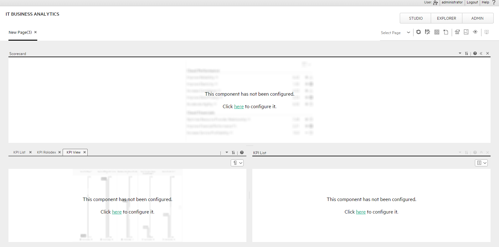
Configure Page Layout – Populate a tabbed component in a page scenario
The following section provides an example of how an administrator configures a page component to include tabs.
It is recommended that you plan in advance which components you want to place on your page and how they should be arranged, and then configure your page layout accordingly.
Add a page to the Dashboard
-
Add a page to the Dashboard, split it into two horizontal areas, and set the top area to tabs. For details, see Create a Dashboard Page and Add Components to the Page.
-
You can now format the page.
Within the layout, you can now add components to the two areas; the components added to the upper section are displayed in tabs and the component added in the lower section of the page is displayed vertically .
-
In the top section of the page, add the KPI List Component to the Dashboard Page
- Click the Component Gallery button.
-
In the Component Gallery page that opens, click or double-click the KPI List component to place it in the layout area, or select the component and drag it to an area on the page. Click Close to view the results.
-
Click the Components
button and in the same way, add more tabbed components.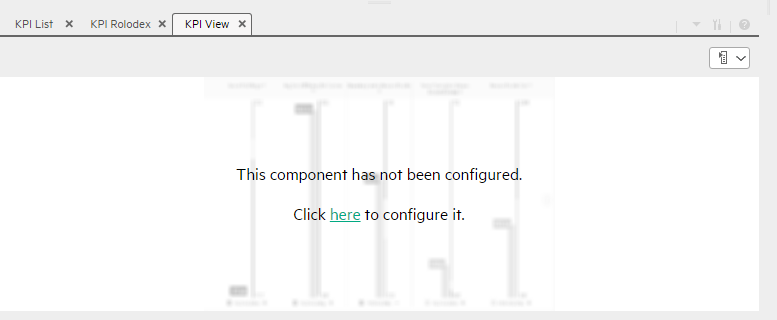
You can now select what you want to display in each component. For details, see the relevant component sections.
- Click the Component Gallery
-
In the lower section of the page, add the Scorecard Component to the Dashboard Page
- Click the Component Gallery button.
-
In the Component Gallery page that opens, click or double-click the Scorecard component to place it in the layout area, or select the component and drag it to an area on the page.
Note that double-click only works if you open the Component Gallery from the layout itself and not from the toolbar.
- If the target area is hidden by the Component Gallery dialog box, click the Component Gallery dialog box title bar and drag it to another location on your screen.
- If you are dragging a new component to a target area that already has a component defined, drag the new component to the title bar of the target area, and not to the part of the component that is colored white.
-
Close the Component Gallery page. The Scorecard component appears in the page.
You can now select what you want to display in the component by clicking the Configure Component
 button. For details, see The Scorecard Component.
- Click the Component Gallery
-
- You can now save the page by clicking . In the Save to Page Gallery dialog box that opens, enter the name, description, and categories of the page.
The new page is now listed in the Page Gallery.
The new page also appears in the Dashboard as a new tab.
- To display the page, in Dashboard, click the Page Gallery
 button in the Dashboard toolbar and select the relevant page.
Use Case - Create a Dashboard Page and add a Scorecard Component to the Page
For details, see Create a Dashboard Page .

Dashboard Workspace
The Dashboard workspace enables you to view default pages, and to create new pages containing components. Each page is displayed as a tab within the workspace.
User interface elements are described below (when relevant, unlabeled elements are shown in angle brackets):
| UI Element |
Description |
||||||||||||||||||||||
|---|---|---|---|---|---|---|---|---|---|---|---|---|---|---|---|---|---|---|---|---|---|---|---|
| <Page Management toolbar> |
The Page Management toolbar on the upper right side of the workspace, enables you to create pages, add components to pages, and define how components interact between one another.
|
||||||||||||||||||||||
| <Layout tools> |
When a layout is empty, the layout tools on the upper left area enable you to define the layout. Icons in the center of the layout indicate the type of layout: horizontal, vertical, or tabbed.
|


We welcome your comments!
To open the configured email client on this computer, open an email window.
Otherwise, copy the information below to a web mail client, and send this email to SW-Doc@hpe.com.
Help Topic ID:
Product:
Topic Title:
Feedback: