
 Words and Phrases


Comfill control
Use this control to add a combination Combo Box and Fill button. Comfill has all the properties of a Combo Box, plus the capability for Fill button. You can select which comfill buttons to display. For example, to display just a Fill button, set the Third Button Visible property to true by selecting the check box and set the Combo Button Visible property to false, by clearing the checkbox.
Note As of Service Manager 9.41, the display name of a CI can be displayed in comfill for mobility. You can fill a CI by its display name.
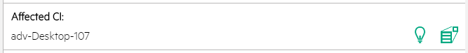
Refer to the following screenshot as an example of the non-array comfill widget with popup form enabled on a Mobile Applications form:
Refer to the following screenshot as an example of the array comfill widget on a Mobile Applications form:

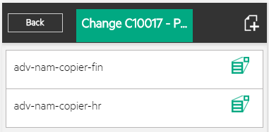
Refer to the following screenshot as an example of the array comfill widget after clicking:
| Property | Usage |
|---|---|
| Name |
(Optional) Specify a unique identifier for the object on the screen. This name is used by external applications, such as RAD, to dynamically change the properties of the object. This name is also used by the Label For property to specify the label of this widget. |
| Input | Specify the database field or variable to associate with this control. |
| Read-Only | Select this option to disable editing capabilities and provide only viewing access to the field. |
| Mandatory |
Select this option so that a red asterisk indicating a required field is displayed. This is a visible change only.
|
| Array Length |
Specify the size of the scrolling region used to view array entries. A scroll bar appears beside the fields to allow users to view the array entries.
Note The screen object must be associated with an array data structure. The default is 0, which means one vertical line of information appears. |
| Value List | In conjunction with the Input property, defines how the Display List values are identified in the database. Value and Display Lists are entered using the Edit List dialog box. You can enter hard coded entries for each list, or you can supply a variable as the first and only entry. The run time values of the variable are used to populate these lists. |
| Display List | Specify the values that appear in the drop-down list at run time. There must be a one–to–one correspondence between the values for Value List and for Display List. If the Display List is the only populated property, the display values are written to the database. |
| Combo Button Visible |
Select this option to make the Combo Button visible when the form opens. Note When this property is enabled, the Fill Button Visible property is no longer effective. |
| Fill Button ID | Specify a Control ID to transmit when clicked. |
| Fill Button Visible | Select this option to make the Fill Button visible when the form opens. |
| Popup Subform Format | Specify the form to display. |
| Popup Subform Input | Specify the database field or variable to associate with this control. |
| Popup Subform Enabled | Select this option to enable the Popup Subform for this control. |


